BridgeTown, Inc Branding System
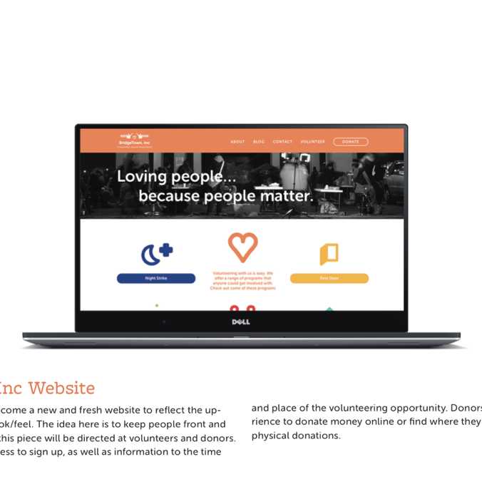
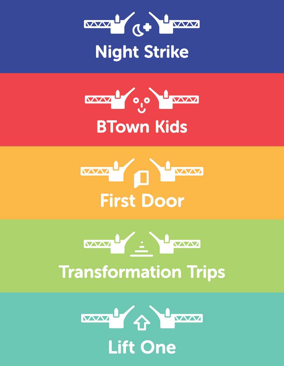
A diverse audience and large brand posed quite a challenge to produce something cohesive, flexible, and understandable that was rooted in the brand’s key characteristics. “Loving people…because people matter” is the life blood of this solution. It’s all about people, friendliness, and care. The line quality of the icons/bridge and main typeface is soft and thick to still provide feelings of strength and foundation. It is a nice balance between friendly and industrial. The icon system was very key to nail down for flexibility and easy recognition once the audience is trained. The color palette is on the softer side and each color has significance to the program it represents.
The bridge part of the logo is always present, it is the hallmark of the brand and acts as a constant container form and foundation of the brand. Strong foundation, friendliness, and love are a few words that sum up this concept. In the end this brand is serving humans and it should live and breathe like a human. Each program has its’ own individuality. In the end, it’s about loving people because people matter.
You can view a full pdf of the deliverable (if not, checkout some highlight images below):

With the diverse amount of programs already living under BridgeTown, Inc, there needed to be a cohesive and dynamic vehicle that could handle the existing mother brand and what the future could hold. The icon system and main mark is built off of the same proportions of the modified typeface. The color palette has room to grow when then brand needs to grow. The patterning you will see later can be adjusted to include the new iconography of new programs and likewise, the color palette pattern can be expanded as well. Simplicity is key with the amount of content that already exists. Simple and timeless with room to grow.


