The Man Brewing
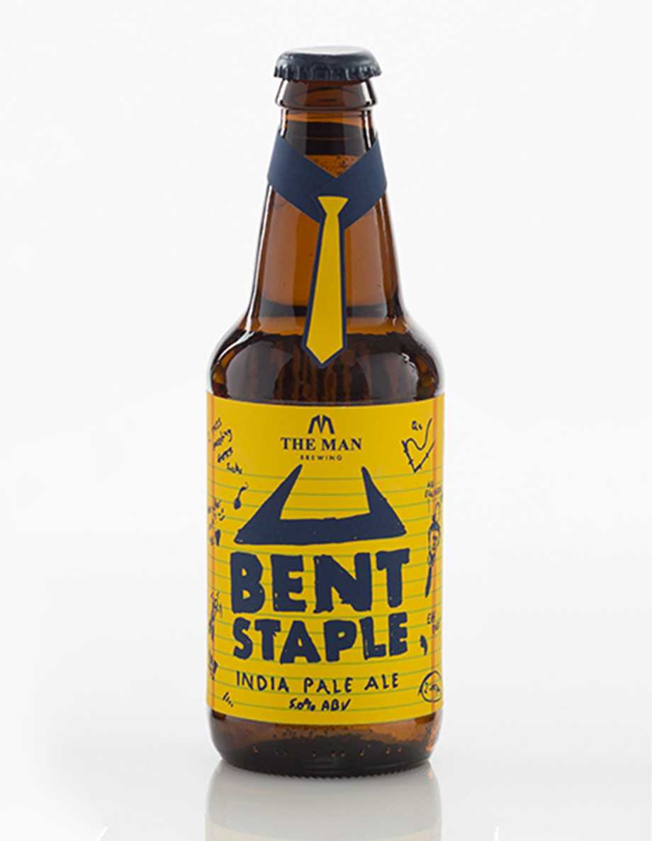
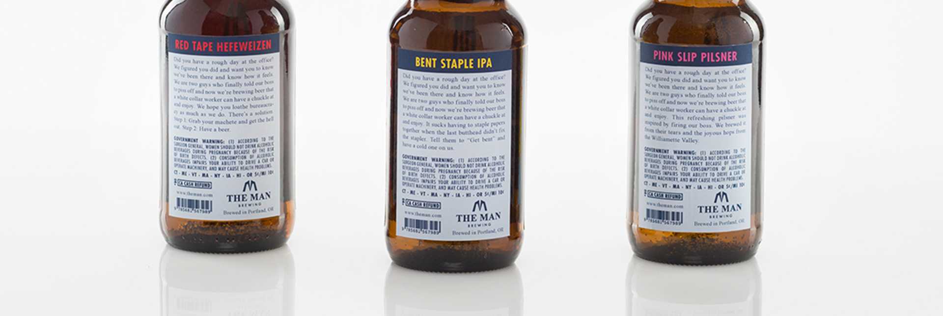
During my market research, I observed that there aren’t a lot of beer options specifically geared towards the white collar world. With this brand, I capitalized on that hole in the market. The goal was to create three beers that the entity could launch with. I drew inspiration from working in an office environment and flipped some stereotypes on their heads. I chose for the labels of each the beers to tell the brand’s story rather than the main mark. That, in and of itself isn’t done very often but the decision was made to push the lightheartedness of The Man Brewing. It also brought in the “corporate overlord versus employee” cliché and applied it to a new industry in a fun approach.
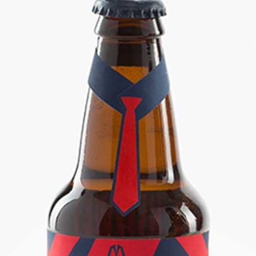
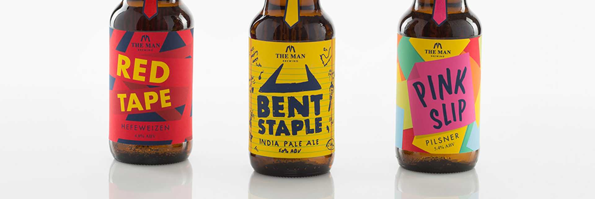
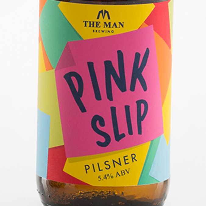
Each of these labels take a playful approach to what some would consider mundane.