
Red Flags Card Game Site
When tasked with the prompt to design a site for a product that was engaging, well-written, and interactive, I jumped at the chance to redesign the experience for the card game Red Flags. Their site in the current state is an off-the-shelf theme, that isn’t very interesting or engaging. The design is very clean, but doesn’t entice one to want to buy from them.
The problem was improving their site to be more visually engaging and interactive. I created a demo of the game and revamped the entire marketing and purchasing experience with both business goals and end user goals in mind.

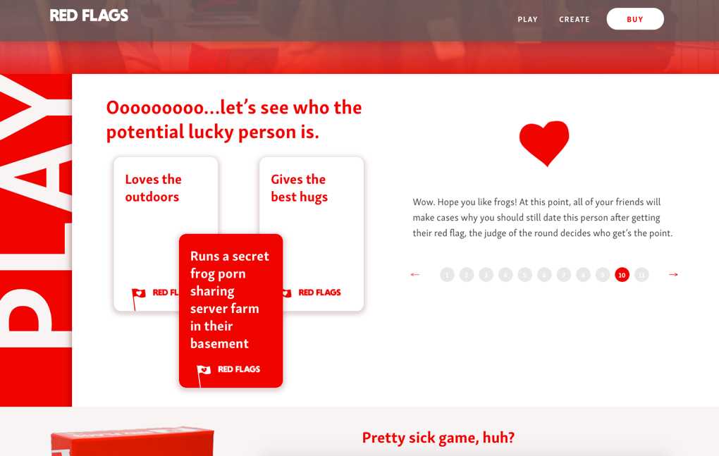
Interactive demo
Given that their exisiting site is basically an off-the-shelf theme, the Red Flags site doesn’t have much interaction or personaility to it. One of solutions to the problem was to build a proof of concept game that could be integrated in, to add a fun and engaging way to learn the game and prompt the user to purchase a copy.